You Did the Work. So Why Is Nobody Converting?
Most people treat conversion-optimization like a design problem. Change the button. Fix the layout. Move the headline up. Run a split test. And sure those things matter eventually. But they’re not where the real problem lives. The real problem lives somewhere most marketers never think to look. Inside the head of the person landing on the page.
Ninety six percent of people who land on your page will leave without doing anything. Not because your product is bad. Not because your price is wrong. Not because they weren’t interested. Just because something on that page something you probably can’t even see quietly pushed them away before they gave it a real chance.
That number used to shock people. Now it’s just Tuesday.
And the strangest part? Most businesses respond to that by changing the button. Moving the headline. Trying a bolder font. Spending another few hundred on traffic to send more people to the same broken experience. The conversion optimization results stay flat. The frustration grows. And nobody stops to ask the one question that actually matters why is the page failing the person landing on it?
Because here’s what the analytics don’t show you. They tell you people left. They don’t tell you what the person was feeling in the three seconds before they did. They didn’t leave because they couldn’t find the button. They left because something didn’t feel right. Maybe the page felt cold. Maybe the headline sounded like it was written for everyone and therefore spoke to no one. Maybe they arrived with a specific problem and the page spent four paragraphs talking about the company instead of the customer.
That’s the real problem. And until you understand the psychology sitting underneath it, no amount of conversion optimization work will fix it for long.
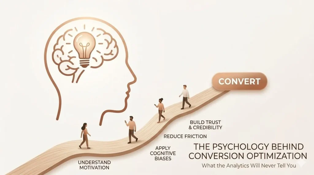
What the Analytics Will Never Tell You
Here’s something most people working on conversion optimization never stop to think about. The way you put information on a page and the way someone actually receives it those are two completely different things.
You build the page to explain. You want people to understand what you do, why it’s good, and why they should pick you. That makes total sense from where you’re standing. But the person who just landed on your page isn’t thinking about any of that yet. They’re thinking one thing is this even worth my next thirty seconds?
Their brain is scanning, not reading. It’s moving fast, looking for reasons to stay or reasons to bounce. And the very first thing it’s doing before a single word registers is asking a quiet background question: can I trust this?
That’s where conversion optimization really begins. Not in the CTA. Not in the pricing section. Right there, in the first few seconds, before the visitor has consciously decided anything at all. Most people running conversion optimization campaigns completely skip this part and that’s exactly why the numbers don’t move.
Your Visitor’s Brain Made a Decision Before They Read Anything
Nobody arrives on a new website feeling relaxed. That’s just not how it works.
You land somewhere unfamiliar and without even realising it, you’re already running a check. Does this feel like a real business? Does it look like someone actually put thought into this — or did they just drag and drop a template and call it done? Is there a real human somewhere behind this page, or is it all just stock photos and hollow promises?
That judgment happens in seconds. Maybe less.
And when something feels off even slightly people know. They can’t always explain it. Nobody sits there thinking “ah yes, this lacks authenticity.” They just get a feeling. Something about the page feels hollow. A little too polished. A little too try-hard. Like nobody actually wrote it somebody just filled in the blanks.
And that feeling sticks. No conversion optimization tweak fixes a feeling that’s already gone bad.
The First Three Seconds Are Already Working Against You
You can have the best offer on the page. The perfect button sitting right there. Doesn’t matter. Once that gut reaction kicks in, the visitor is already mentally halfway out the door. Scrolling further doesn’t fix it. A better paragraph lower down doesn’t save it. You can’t fix distrust by piling more content on top of it.
This is the part of conversion optimization that makes people uncomfortable because it means your page can look completely fine on the surface and still be quietly pushing people away. Not because the design is broken. Because the trust was never there.
Building trust isn’t one big dramatic thing. It’s small honest details done right. A customer review that sounds like a real person wrote it after a long day not a polished five star blurb that could’ve come from anywhere. A recognisable logo or name, shown simply without making a song and dance about it. A writing voice that sounds like someone you could actually have a conversation with.
None of it is complicated. But most pages skip all of it and then wonder why the conversion optimization work isn’t moving the needle. The answer is almost always trust and trust is almost always the thing nobody thought to build first.
The Easiest Decision They Can Make Is to Leave
This one surprises people every time. Give visitors more choices and they often end up choosing nothing at all.
There’s real research behind this. When the brain faces too many decisions at once it gets overwhelmed fast. And when it gets overwhelmed, the easiest move is to just stop. Close the tab. Come back later which usually means they won’t return.
Landing pages do this constantly without realising. Three buttons competing for clicks. Two offers sitting side by side. A navigation bar full of links pulling attention in six directions at once. Every single one of those things adds a tiny bit of mental effort for the visitor. Stack enough of them together and the page starts to feel exhausting just to look at.
Stripping all of that back is one of the most underrated moves in conversion optimization. Ask one honest question — what is the single thing we want this person to do? Then build everything around making that one thing feel simple and obvious. One path. One next step. That’s it. Everything else either moves or disappears. This is the kind of conversion optimization decision that costs nothing but changes everything.
Nobody Actually Decides With Logic Here’s the Proof
A brain scientist named Antonio Damasio once studied patients whose emotional centre of the brain had been damaged. These weren’t unintelligent people. They could reason clearly, process information, hold a conversation without any problem. But ask them to make a decision even a small simple one and they were completely stuck.
That tells you something important about every person who has ever landed on your page.
We often believe our decisions are based on logic. We don’t not really. We feel something first, and then we use logic to explain the decision we already made. That’s how it works for everyone. Including your best customers.
This is exactly where most conversion optimization efforts quietly fall apart. Teams build out the feature list. They write up every benefit. They explain the product from every possible angle. And none of it moves anyone because none of it creates a feeling. It just creates information. And information on its own doesn’t make people act.
The pages that actually work speak to something the visitor already has going on inside a frustration they’ve been carrying around, a goal they haven’t been able to reach, a problem they’re genuinely tired of dealing with. When your page names that thing honestly and clearly, something shifts. The visitor stops skimming. They slow down and actually read. That’s the moment that matters. That’s what conversion optimization feels like when the psychology is finally working with you instead of against you.
Three Seconds. One Question. Most Pages Fail It.
Most people assume the headline is simply a title. Just a label sitting at the top of the page. But it’s actually the hardest working element in any conversion optimization strategy and most headlines are wasting that position completely.
It has about three seconds. That’s it. Three seconds to answer the one question every visitor arrives with is this actually for me?
Headlines that lead with the product almost always fail that test. “Powerful software for growing teams” tells me what you built. It says nothing about whether you understand my problem. But something like “Stop losing track of work that matters” feels more real and relatable. That sounds like someone who gets it.
And when a visitor reads your headline and thinks wait, yes, that’s exactly what I’ve been dealing with something important happens. They stop scrolling on autopilot. They actually pay attention. They feel like the page is talking to them specifically, not just broadcasting at whoever shows up.
That moment of feeling understood is where conversion optimization truly begins. Not at the button. Not at the pricing table. Right there at the very top when the visitor feels seen before they’ve been sold to.
The Promise You Made in the Ad Better Show Up on the Page
This one gets ignored far too often and it costs people a lot of conversion optimization results quietly.
Someone sees your ad. It promises something specific a free guide, a limited offer, a solution to a particular problem. They click. They land on a generic homepage that doesn’t mention the thing they just clicked for. Now they have to go hunting for it.
Most won’t bother.
When the message in your ad matches what’s on your landing page, the visitor’s brain exhales a little. The commitment they made by clicking feels confirmed rather than betrayed. That small moment of relief is a genuinely powerful part of conversion optimization. It costs nothing to get right but breaking it quietly loses people who were already interested and halfway there.
This Was Never Really About the Button
Good conversion optimization was never really about the button color. Or the layout. Or which shade of blue you used for the background.
It’s about treating the person on the other side of the screen like an actual human being. Someone who is busy, a little guarded, and doesn’t owe you a single second of their attention.
Build a page that makes that person feel safe. Make them feel understood. Make the next step feel obvious and easy. Do those three things genuinely not as a checklist, but because you actually care about the experience you’re creating and every part of your conversion optimization starts to work the way it was supposed to.
The clicks go up. The sign-ups go up. The sales follow. Fix how the page feels for the person reading it. The numbers will sort themselves out.